SuperFlex Fitness
Overview
SuperFlex Fitness by Dave Herman is an athletic equipment company specializing in resistance bands. In the history of our collaboration (since 2007), we designed and deployed countless landing pages and marketing campaigns. With Dave’s knowledge of athletic training and product design, SuperFlex Fitness has earned global recognition as a leader in resistance bands and training equipment. It was an honor to help him all those years and see it grow.
- Golf Digest’s Editor’s Choice Award Winner 2016-2022
- Golf Fitness Kit named Best Fitness Equipment 2017, 2018, 2022
- Top 12 Coolest Products at PGA Show
- Reduced abandonment rates 81% (2016-2022)
- Increased Organic Traffic 6.5% YoY (2012-2022)
- Decreased global site Bounce Rate to 18% YoY
- Increased Email Engagements 314% YoY
The Problem(s)
Since there are many projects we did at SuperFlex, I’ll focus on just one for this portfolio: Interactive Training Guides for the Golf Swing Kit and Golf Fitness Kit. One of our popular projects that increased engagement on social media channels by 79%, sales by 42%, and incoming social traffic by 290% (for a duration three quarters). It was April of 2019. And SuperFlex made the decision to discontinue the mobile app traditionally used as a companion with purchase of a kit.
- With the decision to discontinue the mobile training app, how might we deliver demonstrations of training exercises on the Golf Fitness and Swing Kits?
Process
My own adaptation of the double-diamond process with systems-thinking frameworks guided cadence of the project.
1. Discovery
YouTube had long been gaining popularity–especially for instructional content. So popular, that in 2019, it became the #2 most used search engine (second to Google). We knew we had viewers and wanted to begin building momentum for increasing discovery on the platform. This would be a great stepping stone for returning viewers to see future content not bound by purchase of a product as a prerequisite for viewing.
2. Definition
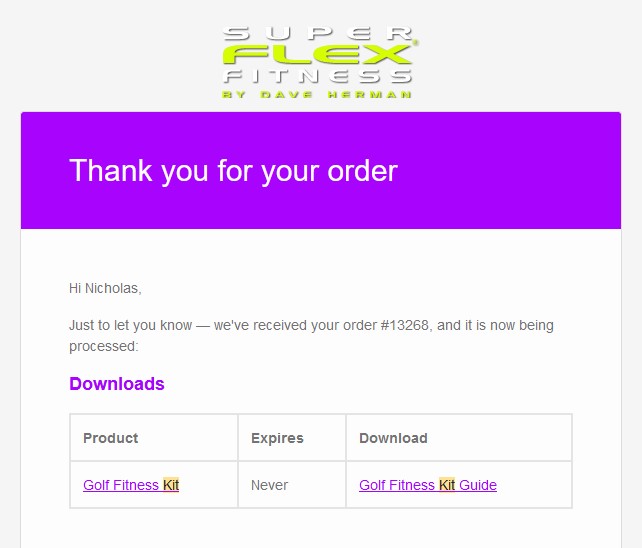
We needed to think about customer touchpoints with the product. Approaching this from new customer and old customer journeys, we knew we had to create a digital product download screen following purchase, while notifying customers their old product had an update.
3. Development
Wireframes set foundations for structuring content along suggestive user journeys. Once we agreed to a simplified structure inherited from the companion app, I refactored imagery and content to an interactive PDF. Typographic treatments were an extension of what people were accustomed to in-app, while aiding new customers on focus areas to orient themselves along a sequence of eight in-depth videos.
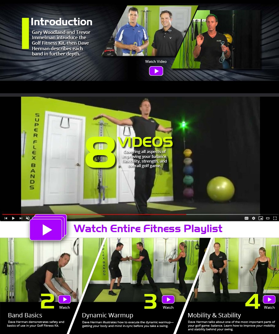
Image thumbnails were strategically selected based on color, angle, topic, and permissions. For static images, we decided to use the skewed edges to allude to motion, rather than incorporating motion to distract from the content.
4. Delivery (Deployment)
We wanted the deployment to be seamless for old customers and obvious for new customers. We deployed an email campaign to keep all customers with previous purchases of the kits and free downloads.
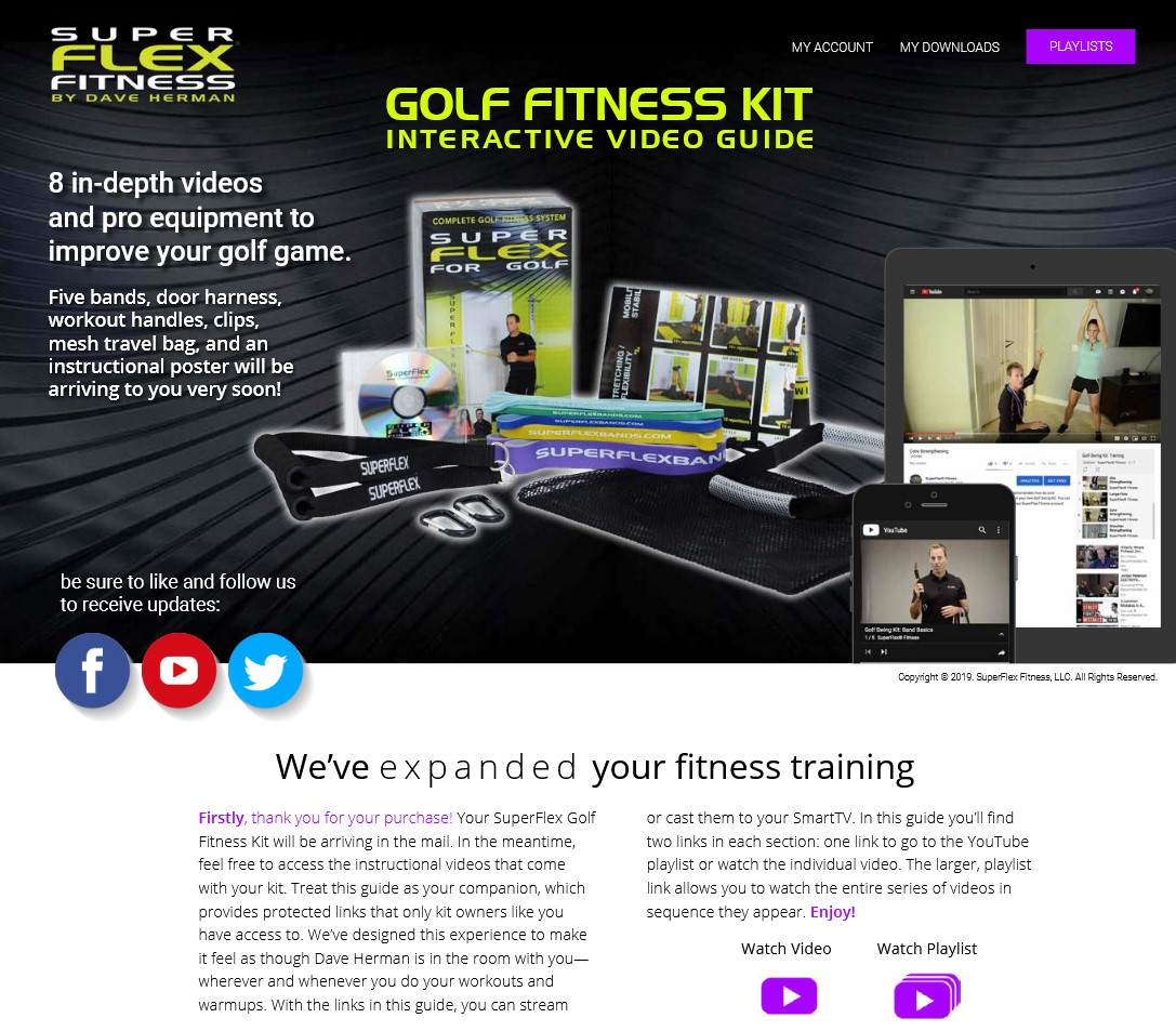
- contextualize design elements to mimic their customer profile page
- append urchin links (UTM campaign parameters) to all links in document
- migrate all previous customers to the new format via email notifications
- provide videos in the same sequences they had on the companion app
- explicate the advantage of watching on TVs, rather than getting stuck on a phone or tablet
Results
Within one year following deployment:
- 306 new subscribers on YouTube.
- 61K views.
- 94% customer retention after migration to PDF and YouTube.